This advertisement makes me love the World Cup
Friday, June 13, 2014
Tuesday, June 10, 2014
Can you recognize these masterpieces?
This seems like the Lego version of the Google Art Project.
Can you guess the paintings that inspired the amazing print ads below?
If you're struggling, here's the list:
The series includes Leonardo da Vinci’s “Mona Lisa” (1505-1507), Vincent van Gogh’s “Self Portrait”, Grant Wood’s “American Gothic” (1930), Rene Magritte’s Johannes Le Fils de L’Homme (1964), Vermeer’s “Girl With A Pearl Earring” (1665) and “Lady With an Ermine”, a portrait of Cecilia Gallerani painted by Leonardo da Vinci (1489/1490).
Wednesday, February 19, 2014
[Advertising Technique] Targeting the Right Audience
I often think of direct mail & trash in the same sentence.
But, what if your advert actually reached the right person (or cat in this case)? Check out the creative technique used in the video above.
PS - Speaking a felines, whoever made this really loves their cat...
[Advertising Technique] Elicit Empathy II
Personally, I don't think it's possible to ever *really* know someone. In fact, it's difficult to even know ourselves. (Or, maybe I just a pessimist).
As Atticus said in "To Kill a Mockingbird":
"You never really understand a person until you consider things from his point of view... Until you climb inside of his skin and walk around in it."A mix of listening and empathy are the only ways to come close.
In the ad below, Alzheimer Nederland makes a good attempt at getting folks to empathize with people suffering from Alzheimer's disease with some help from photoshop and Facebook.
I wonder if this advertising technique could be used for other cause-based organizations.
PS - The diagram below shows the differences between a healthy brain & an advanced alzheimer's brain from azl.org
Friday, December 13, 2013
[Advertising Technique] Sympathizing with the audience
 |
| Photopin |
As a general rule, people hate commercials (unless it's the Superbowl, which is the one permutation folks dig).
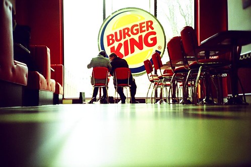
Well, Burger King decided to launch 64 pre-roll YouTube ads. That's a lot.
To get more people to hate them? Nope.
To sympathize with the viewer.
Check out the video below describing the campaign. It's humorous, endearing and targeted. It makes me want to visit Burger King (which, would be the first time I've thought that in my life).
Friday, December 6, 2013
This is Awesome: Design Matters Podcast
Lately, I've been bored by the internet. Let down.
Yes, I know it contains more information than I could ever dream of reading, even if singularity actually happened, and my brain was taken over by robots.
You know why?
Everything seems to be the same (this article explains it well).
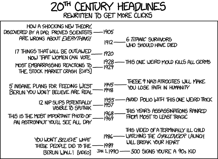
My twitter feed looks like the XKCD comic below, and apparently, all paragraphs have vanished and been replaced with lists that read like "15 Facebook couples you should totally block" and "9 photos of Taylor Hanson looking like a celebrity fangirl" (okay, maybe I just need to block Buzzfeed).

Luckily, the internet has been redeemed.
During my recent drought, I stumbled across an awesome Podcast series, Design Matters, by Debbie Millman (archives here & here).
I learned that Dan Pink keeps a design journal where he writes downs examples of good and bad design in order to strengthen his "right brain." He also wrote a career guide in the form of a graphic novel (i.e., a comic) called "The Adventures of Johnny Bunko" (it became the first, and likely only, comic to make the BusinessWeek bestseller list). The podcast was FULL of interesting facts, including the size of the self-storage industry in the US ($17B & growing) and the percentage of printed material in Japan that's also a comic (22%).
I also listened to Milton Glaser, the designer of the "I heart NY" logo, contemplate ethics in the brand & design world (something I've becoming increasingly interested in since working with brand clients advertising with Google). I also discovered his manifesto, "The 12 Ways to Designer Hell," which is animated in the video below (yes, I realize it's a list, but it has nothing to do with Taylor Hansen or Facebook couples).
My faith in the internet has now been restored.
Thank you, Design Matters.
Yes, I know it contains more information than I could ever dream of reading, even if singularity actually happened, and my brain was taken over by robots.
You know why?
Everything seems to be the same (this article explains it well).
My twitter feed looks like the XKCD comic below, and apparently, all paragraphs have vanished and been replaced with lists that read like "15 Facebook couples you should totally block" and "9 photos of Taylor Hanson looking like a celebrity fangirl" (okay, maybe I just need to block Buzzfeed).

Luckily, the internet has been redeemed.
During my recent drought, I stumbled across an awesome Podcast series, Design Matters, by Debbie Millman (archives here & here).
I learned that Dan Pink keeps a design journal where he writes downs examples of good and bad design in order to strengthen his "right brain." He also wrote a career guide in the form of a graphic novel (i.e., a comic) called "The Adventures of Johnny Bunko" (it became the first, and likely only, comic to make the BusinessWeek bestseller list). The podcast was FULL of interesting facts, including the size of the self-storage industry in the US ($17B & growing) and the percentage of printed material in Japan that's also a comic (22%).
I also listened to Milton Glaser, the designer of the "I heart NY" logo, contemplate ethics in the brand & design world (something I've becoming increasingly interested in since working with brand clients advertising with Google). I also discovered his manifesto, "The 12 Ways to Designer Hell," which is animated in the video below (yes, I realize it's a list, but it has nothing to do with Taylor Hansen or Facebook couples).
My faith in the internet has now been restored.
Thank you, Design Matters.
Thursday, December 5, 2013
Slinging Mud
The Daily Show
I basically remember two things from the 2012 election:
- Incredible Jon Stewart fodder (man, was I sad when the election was over for that alone)
- Lots of mudslinging by both parties
I've come to predict this in politics, yet this technic is less expected in conventional advertising.
Therefore, I was a bit surprised that Microsoft ramped up it's "Scroogled" campaign this quarter, slinging more mud at Google.
Therefore, I was a bit surprised that Microsoft ramped up it's "Scroogled" campaign this quarter, slinging more mud at Google.
They've launched shirts that you can buy at Microsoft.com
And, a new set of videos (that are ironically being run on YouTube, a Google property)
I'm totally fine with a company bringing to light potential flaws in a competitor's product.
But, has Microsoft gone too far to the point of "desperate"?
No comment.
Wednesday, December 4, 2013
Wiki Pledge: It worked on me
I've seen the Wiki Pledge before.
Typically, I look at it, feel a bit guilty and then move on down a wiki-hole.
Note: I'd like to say my wiki-holes involved incredibly intellectual things like thermodynamics or 18th century Russian literature. In reality, I just dig really deep into famous people's personal lives and / or known controversies. It's basically my dorkier version of People magazine.
But today, I donated.
Why?
Two reasons based on social psychology:
1. Social Exchange:
In a social exchange, both parties take responsibility for one another and depend on each other. This pledge reminded me that I have taken more than I have given back, and therefore, made me feel very guilty.
I mean, they are "just a small non-profit that runs the #5 website in the world"
2. The Foot-in-the-Door Technique:
They asked for the smallest donation -- just $3 USD. And, they made it so easy with a button that led directly to Paypal.
I just couldn't say no without feeling like a complete asshole.
Therefore, I donated, but I'm fully aware I'll likely be on their eDM list forever with suggestions on "bigger and better ways" to contribute (which, I probably should).
Regardless, for the time being, Wikipedia has taken down the banner ad on my wiki searches (pretty clever functionality).
Now, off to "research" Rob Ford. Phew.
Thursday, November 21, 2013
Advertising Technique: Social Commentary
I love how this commercial by Goldieblox doesn't tiptoe around the issue at hand.
Let's make them better (to the beat of the Beastie Boys).
Wednesday, November 6, 2013
Advertising Technique: Visual Pun II
I've blogged about visual puns before, but I thought this Pepsi ad from Belgium was especially clever.
I love when a brand doesn't take itself too seriously. I like my people the same way ;)
Saturday, October 26, 2013
Advertising Technique: Elicit Empathy
 |
| Source: Design Taxi |
"The distress we see someone experiencing — the compassion we feel for them — isn’t determined by the objective facts on the ground; it’s determined by who’s looking. … It’s not the severity or the objective facts of a disaster that motivate us to feel compassion and to help — it’s whether or not we see ourselves in the victims." - David DeStenoIf facts alone were convincing, the world would look very different.
We'd take global warming seriously.
Hunger would be a thing of the past.
And, cigarettes would not be on the shelf.
Instead, we need stories to be convinced. We need to feel a connection.
That's why I really like this Equal Pay campaign by Publicis & the International Women's Media Foundation.
"According to statistics, women’s earnings in the US “were 77% of men’s in 2011”, while in Switzerland, women earned “roughly 20% less than equally skilled men in comparable positions”.If this fact really resonated with us, we'd be a lot more vocal. In reality, progress has stalled.
To bring the stat to life, they launched an "Equal Pay Day" where men received 20% less money when they took out money from an ATM. They got to actually walk in someone else's shoes for the day.
See the video below.
Tuesday, October 15, 2013
Advertising Technique: The Witty Response
Last week, we held a Brand Workshop at Google Singapore. This is one of my favorite advertising examples from the 2 days...
Bodyform sells "lady products" (i.e., sanitary napkins). It's not the sexiest product on the market. Traditionally, they've advertised with ladies bike riding, ladies riding roller coasters, ladies swimming in ocean -- all during that "special" time of the month.
Well, Richard realized it was all a hoax. It's really not all that special. He even posted it on Bodyform's Facebook page, and 78K people "liked it."
Rather than write a generic response, Bodyform produced the video below in 8 days (which is incredibly fast in the advertising world).
It's really funny. And, increased sales by 260% during the 3 months after the video (yes, this needs to be fact checked -- I'm using my memory) and has 5.3M YouTube views to date.
Check out the video...
Subscribe to:
Comments (Atom)


