

(Source: Henri Cartier-Bresson)
I'm a photography novice. I somehow managed to buy a really fancy camera from a guy leaving Singapore for ~$325 USD (about 20% the original cost). I basically stole it.
It makes people think I'm a fancy photographer (I'm okay with the illusion). It also makes people want to "talk shop" (which turns into a very short talk).
Confession time -- I'm just now learning the difference between Black & White vs Color photography. Not the pigment (I'm not colorblind); just when to use one versus the other.
Before, I typically turned a photograph into B&W on two occasions:
- When I was feeling "artsy" on Instagram
- I took a shitty photo and thought I could save it by upping the contrast & turning it into B&W
We see our world in color -- a rainbow palette of swirling color at every turn of the head (okay, that was overindulgent).
Therefore, a B&W photo will natural cause us to stop; it's different.
It's typically best to use B&W when:
1. It's about the purity of light & shadow
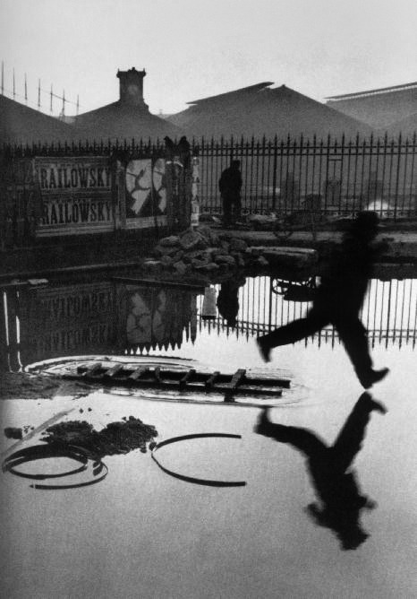
(Source: Henri Cartier-Bresson)
2. It's about effective composition (remember these from a previous post). Diagonals, rule of thirds, oh my!
(Source: Henri Cartier-Bresson)
3. You want the viewer to get super emo and / or depressed (or, just engaged)

(Source: Mike Shaw)
On the other hands, you should use color when...
1. It's about the dominant hue of the photo (green & burnt orange)

(Source: Steve McCurry)
2. It's about the color of the light (a 60s horror film glow in this case)

(Source: Cindy Sherman)
3. You are able to minimize distracting colors to your benefit (we don't need a piñata)

(Source: Annie Leibovitz)
No comments:
Post a Comment